Diving into the April 2015 Material Design Update
Before the release of Android 5.0 Lollipop,
the Holo Design guidelines served as the
official reference for Android design, right
from IceCream Sandwich to KitKat.
However, updates to the guidelines were
few and far between, leading to a lack of
synchronization between Android design and
current UI/UX trends. Google seems to have
learned from their mistake the last time
around, and earlier this week, a significant
update was released for the Material Design
guidelines, marking the second revision in
less than a year.
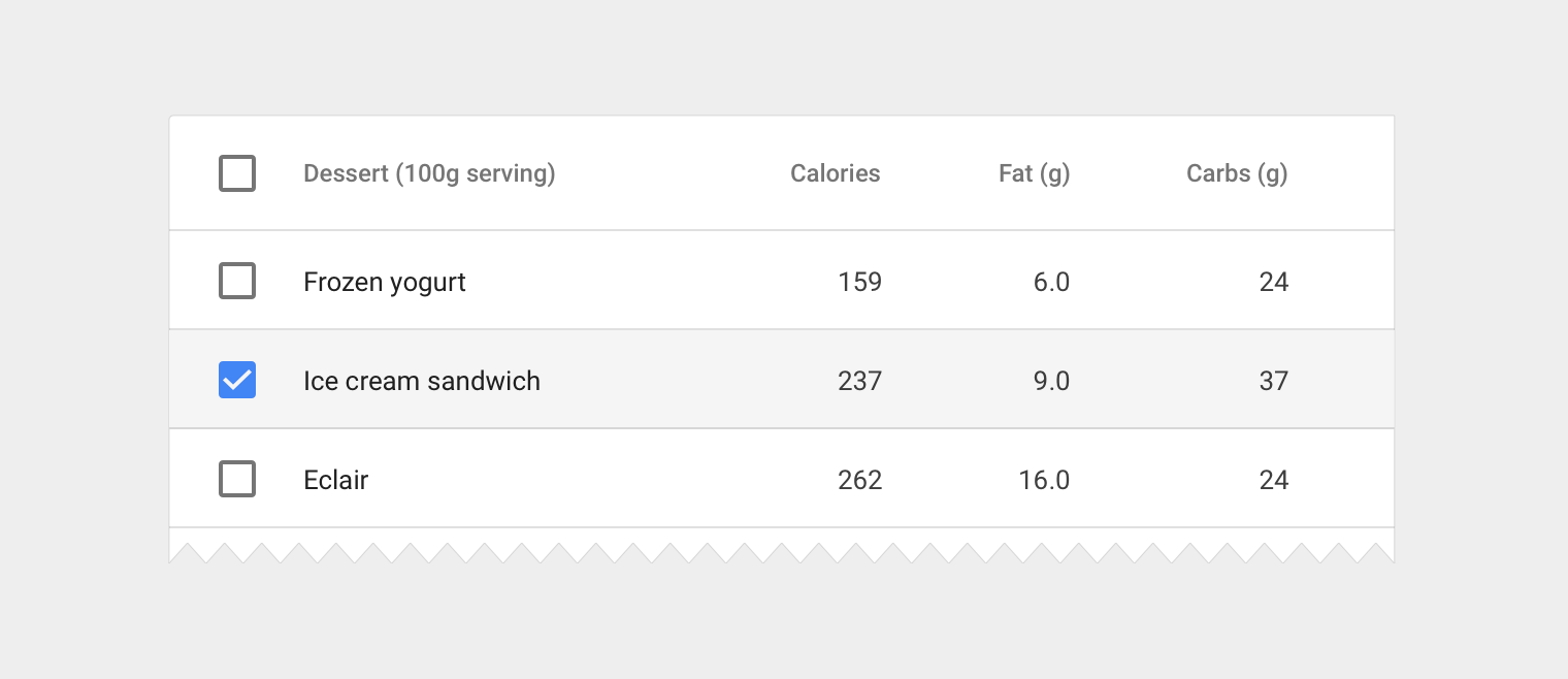
The dominant category in the April 2015
update is data tables and data structure,
with two entire sections being dedicated to
how data should be presented in tables, the
font sizes, weights and colors that should be
used, the padding and layout of the tables
and how the data itself should be structured
and truncated if the need arises. App
Structure is also given a significant amount
of focus, with the guidelines delving into
how hierarchy and structure dictate an
application’s flow and which patterns should
be used where.
The iconic Floating Action Button that has
become almost synonymous with Material
Design, earlier resided under the Buttons
category, but the update has seen moved to
its own section in the guidelines, enforcing
its claim as an important and predominant
element in the app. In addition to the new
sections, updated layout and style guidelines
have also been appended to the Typography,
Cards, Dialogs, Tabs and Scrolling
Techniques sections. And lastly, Google has
also gone ahead and made available a
component sticker sheet for Adobe After
Effects, to streamline the flow for motion
designers and simplify their design cycles.
With the update arriving while Android 5.1 is
still fresh of the presses, Google has set
themselves up for a well planned increment
cycle, ensuring that each API release
received consequent design updates,
furthering claims that Material Design is
here to stay. What do you think about the
updated guidelines and Google’s update
cycle? Let us know in the comments section
below!


